How to Learn Interaction Design with A Simple WeUI Model?
Art
has many independent parts, but all of those parts have something in
common. UI/UX design is also a kind of art, like painting. UI/UX design
also needs imitations to improve our level.
There is an old chinese saying: draw a tiger with a cat as the model. If you take a wrong example, you would copy the example without catching its spirit. Well, where can we find suitable examples to imitate? In fact, the famous Apps we daily use are the best examples for us, such as WeUI, the designing tool for Mini app in WeChat.
First of all, we need to find the model of WeUI, it's really easy to do. There are plenty of excellent examples in Mockplus Demo Project, including Gogobot, BBC Sports, and of course, WeUI. Although there aren't many pages in this demo project, it contains everything you need for UX design. And, sure, you can also find the whole file at WeChat Developing Platform.
Here, let's try out the example first. Because these are just some irrelevant pages, so there's no page link here, please switch the page at the control panel on the left.
Actually, the main point in this demo is the first page. Now, open this demo, let's check out the designing here.
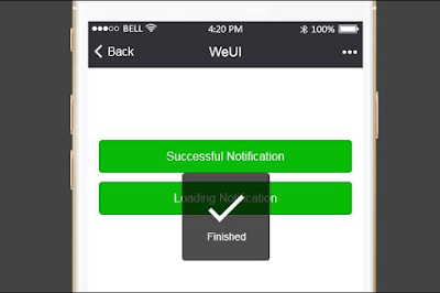

There's no necessary to talk more about the basic lay out, we are just focusing on the interaction designs. In the first half of this page, you can find a yellow area, in fact, there are two groups put in the same place. These two groups match with two conditions: "Finished" and "Loading". When you click the button "Successful Notification", there should be a message box tells "Finished", and then disappear by itself in 1.5 seconds. When you click the button "Loading Notification", the message box "Loading" will appear and then disappear just like the "Finished". OK, now we have seen the animation, how to make a prototype like this?
It's not difficult to make a message box which could be disappeared by itself. We could use Image, Shape and Label to make a "Finshied" message box, then we choose all of those components, right click on them, select Group. Now, we uncheck the option "Visibel" in the Property Panel on the right.

Next, we are going to set an interaction: Drag the
link point to the yellow area, then drop it, choose the command
"OnClick" > "Show/Hide", then, we need to open the "Parameter Panel",
choose the option "Show". This is how we set an interaction of showing
the "Finished" message box by clicking on the button. Well, how to make
this message box disappear by itself? It is pretty easy, just a two
changes from this process.

Still, we need to drag the link point
to the yellow area, choose the command "OnClick" > "Show/Hide",them,
we need to open the Parameter Panel, but, this time we choose the option
"Hide". And there's on more step: input number "1500" in the "Delay"
box, it means this interaction will happen in 1500 milliseconds, 1.5
seconds, after you click the button. So, this is how we make the message
box disappear by himself.

In the same way, we could easily set the interactions to "Loading" message box.
So, that's it. Now, we move to the other half of this page.
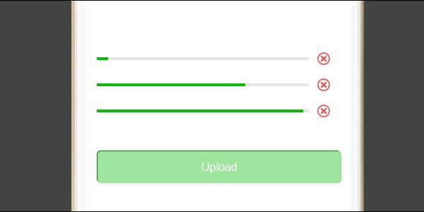
It seems that there are only three process bars. But, in fact, they come in twins, check out this picture, is it clear now?

How to set the interactions to make those little green Shapes become alive? Here, we drag the link point of "Upload" button to those Shapes, then use the command "Resize". After the commands have been successfully set to these components, please remember, there are two more things you need to do:
1. Choose a suitable "Anchor" in the "Parameter Panel".
2. Input a suitable number at "Duration".

"Upload" button here has a simple interaction: "OnClick" > "Show/Hide" to the other invisible "Upload" button.
Interactions in Page 3 are basically the same as the first part of Page 1. There are more components in different styles at Page 2, 4 and 5. I hope those components could be good references for you.
Well, how about now? Get another skill at UX design, right? There are more demo projects in Mockplus Totorial. I will introduce more design tips next time.
There is an old chinese saying: draw a tiger with a cat as the model. If you take a wrong example, you would copy the example without catching its spirit. Well, where can we find suitable examples to imitate? In fact, the famous Apps we daily use are the best examples for us, such as WeUI, the designing tool for Mini app in WeChat.
First of all, we need to find the model of WeUI, it's really easy to do. There are plenty of excellent examples in Mockplus Demo Project, including Gogobot, BBC Sports, and of course, WeUI. Although there aren't many pages in this demo project, it contains everything you need for UX design. And, sure, you can also find the whole file at WeChat Developing Platform.
Here, let's try out the example first. Because these are just some irrelevant pages, so there's no page link here, please switch the page at the control panel on the left.
Actually, the main point in this demo is the first page. Now, open this demo, let's check out the designing here.

There's no necessary to talk more about the basic lay out, we are just focusing on the interaction designs. In the first half of this page, you can find a yellow area, in fact, there are two groups put in the same place. These two groups match with two conditions: "Finished" and "Loading". When you click the button "Successful Notification", there should be a message box tells "Finished", and then disappear by itself in 1.5 seconds. When you click the button "Loading Notification", the message box "Loading" will appear and then disappear just like the "Finished". OK, now we have seen the animation, how to make a prototype like this?
It's not difficult to make a message box which could be disappeared by itself. We could use Image, Shape and Label to make a "Finshied" message box, then we choose all of those components, right click on them, select Group. Now, we uncheck the option "Visibel" in the Property Panel on the right.


In the same way, we could easily set the interactions to "Loading" message box.
So, that's it. Now, we move to the other half of this page.
It seems that there are only three process bars. But, in fact, they come in twins, check out this picture, is it clear now?

How to set the interactions to make those little green Shapes become alive? Here, we drag the link point of "Upload" button to those Shapes, then use the command "Resize". After the commands have been successfully set to these components, please remember, there are two more things you need to do:
1. Choose a suitable "Anchor" in the "Parameter Panel".
2. Input a suitable number at "Duration".

"Upload" button here has a simple interaction: "OnClick" > "Show/Hide" to the other invisible "Upload" button.
Interactions in Page 3 are basically the same as the first part of Page 1. There are more components in different styles at Page 2, 4 and 5. I hope those components could be good references for you.
Well, how about now? Get another skill at UX design, right? There are more demo projects in Mockplus Totorial. I will introduce more design tips next time.


Comments
Post a Comment