How to Make A Good Prototype? (II)
In the other article, we have explained some theories and steps of how to make a good prototype. If you are interested, please kindly check out here.
In this article, I will list some common details of prototype design.
1. iOS prototype design
As the "best seller" in Mobile device Apple has taken a large part of this market. Because of this, iOS products are also coming like a storm.
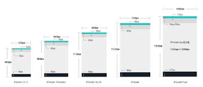
![]() As you can see in the picture, this is the recommend for iOS prototype design. Every part of this iPhone product strictly obeys with the proportion. The action bars' width is always the multiple of 44, the navigation bar is always the multiple of 49.
As you can see in the picture, this is the recommend for iOS prototype design. Every part of this iPhone product strictly obeys with the proportion. The action bars' width is always the multiple of 44, the navigation bar is always the multiple of 49.
2. Web prototype design

![]() There is a really important advice for web prototype design. For the height of the content on first screen, different user has different thoughts. When the content height is 580px, there will be 40% people could see the half below the content. When the content height is 720px, there will be 82% people could see the half below the content. When the content height is 800px, there will be 92% people could see the half below the content. It means the more you give to the content in first screen, the less people will see the other part in this page. Designers need to keep the balance.
There is a really important advice for web prototype design. For the height of the content on first screen, different user has different thoughts. When the content height is 580px, there will be 40% people could see the half below the content. When the content height is 720px, there will be 82% people could see the half below the content. When the content height is 800px, there will be 92% people could see the half below the content. It means the more you give to the content in first screen, the less people will see the other part in this page. Designers need to keep the balance.
Another tip on prototype design tool

Many design tools would not provide complicated components. What should we do when we really do need complicated components? The answer would be easy: Group them! For example, in Mockplus or Balsamiq, when you need a realistic navigation bar, you can drop some basic components, and group them. Just like the picture here.
![]() And, of course, there are more things we need to pay attention to, hope you can drop some thing useful below.
And, of course, there are more things we need to pay attention to, hope you can drop some thing useful below.
In this article, I will list some common details of prototype design.
1. iOS prototype design
As the "best seller" in Mobile device Apple has taken a large part of this market. Because of this, iOS products are also coming like a storm.

2. Web prototype design

Another tip on prototype design tool

Many design tools would not provide complicated components. What should we do when we really do need complicated components? The answer would be easy: Group them! For example, in Mockplus or Balsamiq, when you need a realistic navigation bar, you can drop some basic components, and group them. Just like the picture here.


Comments
Post a Comment