How to Distinguish Design Sketch and Prototype?
Product design is a relatively broad concept which contains a lot of content. Especially for beginners, the division of labor in the product design really gives them headaches. Some designers often do not even know what they are designing in the end. Boss told you to make a certain design, but when you gave your design to him, he might be like:"OH MY GOD! What is this?" Here, I will introduce you the best couple that often lead us to the confusion—rendering and prototype.
First, we need to have general understandings of them:
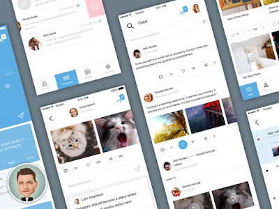
Design sketch, are the images with visualization. This type of images is often already been processed by the UI designers. They are some models which exhibit the real product. Product design sketch is one way of designers to express their creativity. Meanwhile, a good design sketch can objectly upgrade your score from your users, and show the value of this product.
According to wikipedia, a prototype is an incomplete version of software, built so users can experience some of the proposed features or properties. It is a part of a complete system developing life circle. If it's necessary, the prototype should be revised over and over again, until it is acceptable. The meaning of a prototype is to tell the programmers what are the designers thinking about.
From those details below, you can find out the differences between design sketch and prototypes.
1. Tell from the color
Prototypes are often based on black and white, of course, there are some prototypes called grayscale prototypes. Why the prototypes are all in this kind of simple colors? The reasons are simple too. First of all, prototype designers are not UI designers. If there were massive kinds of colors, it would definitely affect the decision made by the UI designers. Second, prototypes are often made for programmers. What they want are the logics and interactions, not the color.
Usually, design sketch is not so simple. It will be a serious problem when a product design sketch looks the same as a product prototype. Unless that is on purpose, the designer is really low. As the pretty face of a product, design sketch is a careful decision made by the designers.
2. Tell from the icon
Now, in the prototype designing, designing and using an icon are too simple to notice. But, in a strict sense, there shall be no icon in a prototype but some blank squares. The reason is the same as the previous one, that is to reduce the possibility which might affect our colleagues, such as UI designers. Of course, many prototyping design tools offer simple and useful icons. This makes things really easy. Thoses kind of icons is easy to understand. This not only can save the trouble, but also give the next designer enough space.
But, design sketch is different. In a design, the details are the main aspect of this design sketch. What's more? The design sketch is also ruling. So, please don't be surprised if you saw the crafted icons. A good designer can express his creativity from every detail in his project.
3. Tell from the note
From my personal understanding, a ture design sketch does not need a note at all. As long as the design sketch is one way to exhibit our product to the users, this should be clear whenever the user sees this. There's hardly an exception. With more and more notes on your design sketch, you will be paid less and less.
However, the prototypes are different. If there are just some simple wireframes, there will be no value when there is no word. When you are using a prototype with interactions, the note and markups will be less.
In a conclusion, we can tell whether it is a prototype or a design sketch from color, icon and note. Logical and easy to use, they are the best things of the prototype. Pretty and visualized, those will make a great design sketch.
So, do you have any idea about what you have desinged yesterday?


Comments
Post a Comment